Η σωστή οπτική ταυτότητα σε συνδυασμό με μια επαγγελματική ιστοσελίδα είναι αυτό που ξεχωρίζει μια επιχείρηση από τον ανταγωνισμό. Σε αυτό το άρθρο εξηγούμε πώς εφαρμόσαμε ολοκληρωμένο branding στην εταιρεία Χωματουργικές Εργασίες Καλογιάννης, από τον σχεδιασμό λογοτύπου και τα αυτοκόλλητα στα μηχανήματα μέχρι την κατασκευή της ιστοσελίδας.
Γιατί ο Μινιμαλιστικός Σχεδιασμός Λογοτύπου Φέρνει Αποτελέσματα
Ο υποψήφιος πελάτης κρίνει μια επιχείρηση σε λιγότερα από πέντε δευτερόλεπτα. Όσο πιο καθαρό είναι το logo, τόσο πιο γρήγορα μεταδίδεται το μήνυμα και χτίζεται εμπιστοσύνη. Ένα μινιμαλιστικό logo λειτουργεί παντού, από το favicon της ιστοσελίδας μέχρι την πινακίδα ενός εργοταξίου, και αποτελεί την πιο ευέλικτη επιλογή για κάθε επιχείρηση.
Η Σημασία των Χρωμάτων στην Οπτική Ταυτότητα Επιχείρησης
Σχεδόν το ενενήντα τοις εκατό της πρώτης εντύπωσης για ένα brand προέρχεται από το χρώμα του. Το μπλε επικοινωνεί αξιοπιστία και σταθερότητα, το κίτρινο ενέργεια και ορατότητα, το πράσινο σύνδεση με τη φύση, το κόκκινο δύναμη. Η σωστή παλέτα χρωμάτων δεν είναι αισθητική επιλογή αλλά στρατηγική απόφαση που πρέπει να ταιριάζει με τον κλάδο και το κοινό-στόχο.
Case Study: Branding και Ιστοσελίδα για τις Χωματουργικές Εργασίες Καλογιάννης
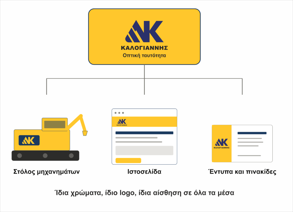
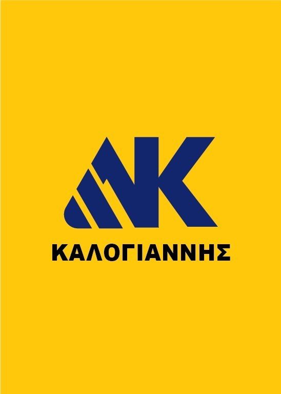
Αναλάβαμε τη δημιουργία ολοκληρωμένης οπτικής ταυτότητας από το μηδέν. Επιλέξαμε μόνο δύο χρώματα με συγκεκριμένα κριτήρια. Το έντονο κίτρινο αντιπροσωπεύει το χρώμα των ίδιων των μηχανημάτων, δημιουργώντας αυτόματη σύνδεση μεταξύ της επωνυμίας και του εξοπλισμού στο εργοτάξιο. Το σκούρο μπλε λειτουργεί ως κοντράστ που αναδεικνύει το κίτρινο, ενώ ταυτόχρονα προσδίδει αίσθηση επαγγελματισμού και αξιοπιστίας. Το σήμα με τα στιλιζαρισμένα βουνά συνδέει άμεσα την επωνυμία με το αντικείμενο της επιχείρησης, καθιστώντας το logo αναγνωρίσιμο ακόμα και από απόσταση.
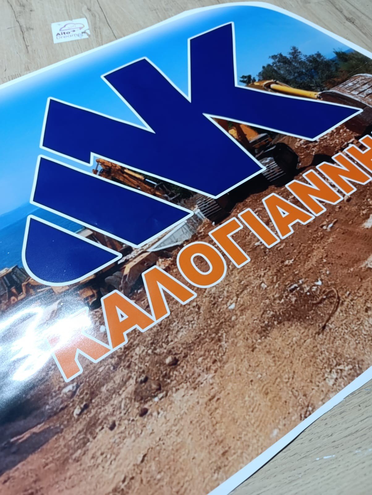
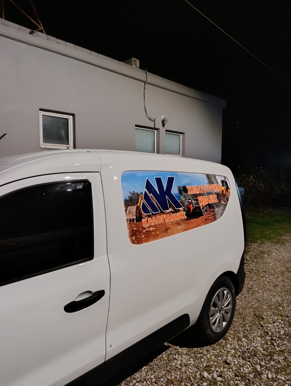
Στη συνέχεια κατασκευάσαμε αυτοκόλλητα οχημάτων με το λογότυπο της εταιρείας και τα τοποθετήσαμε σε κάθε εκσκαφέα, φορτηγό και μηχάνημα του στόλου. Τα μηχανήματα μετατράπηκαν σε κινητό διαφημιστικό μέσο που χτίζει αναγνωρισιμότητα σε κάθε εργοτάξιο της περιοχής. Το κίτρινο του logo πάνω στο κίτρινο του μηχανήματος δεν δημιουργεί σύγχυση, αντίθετα ενισχύει την ταύτιση. Το σκούρο μπλε κοντράστ εξασφαλίζει ότι το σήμα ξεχωρίζει ευκρινώς ακόμα και σε συνθήκες σκόνης και χωμάτινου φόντου.
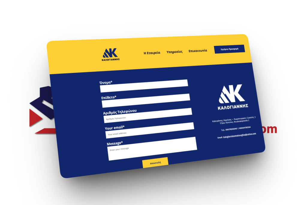
Παράλληλα, αναλάβαμε την κατασκευή της επίσημης ιστοσελίδας της εταιρείας στο xomatourgikakalogiannis.gr, διατηρώντας απόλυτη συνέπεια με την οπτική ταυτότητα. Τα ίδια χρώματα, το ίδιο σήμα, η ίδια αίσθηση. Το αποτέλεσμα είναι μια εταιρεία χωματουργικών εργασιών που μεταδίδει επαγγελματισμό σε κάθε σημείο επαφής με τον πελάτη, online και offline.
Γιατί η Κατασκευή Ιστοσελίδας Πρέπει να Ακολουθεί τη Στρατηγική του Brand
Η ιστοσελίδα είναι ο εικοσιτετράωρος πωλητής της επιχείρησής σου. Όταν τα χρώματα, οι γραμματοσειρές και η αισθητική της δεν συμφωνούν με το logo και τα υπόλοιπα υλικά, η εμπιστοσύνη σπάει αυτόματα. Μια σωστά σχεδιασμένη ιστοσελίδα συνεχίζει την οπτική ταυτότητα, οδηγεί τον επισκέπτη στην πληροφορία που χρειάζεται γρήγορα και μετατρέπει την επίσκεψη σε επικοινωνία.
Ολοκληρωμένο Branding από την autokollato.com
Στην autokollato.com αναλαμβάνουμε σχεδιασμό λογοτύπου, αυτοκόλλητα οχημάτων και μηχανημάτων, έντυπα, πινακίδες και κατασκευή ιστοσελίδας, ώστε η επιχείρησή σου να ξεχωρίζει με συνέπεια σε κάθε σημείο επαφής. Επικοινώνησε μαζί μας σήμερα και ας δούμε πώς θα δώσουμε στη δική σου επιχείρηση το brand που της αξίζει.